Midterm
For my project, I decided to use RAWGraphs.io to visual Tate’s artists stratified by gender and location.
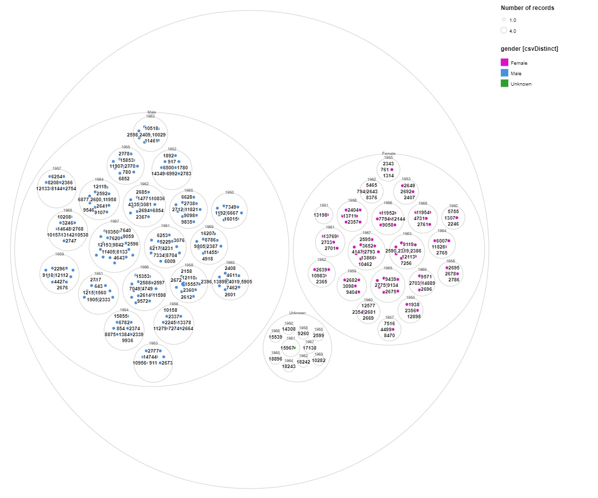
Circle Packing Graph of Tate artists
An analysis and data visualization of Tate artists focused on gender
Introduction
For my project, I used RAWGraphs.io to visualize the artists that had been displayed in Tate art gallery. I tried to create a visually appealing visual that told a story about the distribution and separation of artists by gender over the time period of 1950-1969. I used multiple tools, such as RAWGraphs and OpenRefine, to create this visual of the database.
Sources
I used a dataset with over 400 artists who had been displayed in the gallery. The dataset initially included terms like ID, dates of birth and death, location of birth and death, gender, and a link to the artist on Tate’s website. The link takes you to a page where the artists are provided a biography about their life and impact on contemporary art.
Processes
Initially, I was a little overwhelmed with everything that was included in the data set. I decided to delete the place of death column since the vast majority of the artists were alive so there was no data for most of it making it a bad column to try and base a visual off of. I ended up deleting the year of death column for a similar reason. The last major change I made was to fill in the blank cells in gender, year of birth, and location of birth with unknown since I believe that even with some of those being missing, the data is still valuable. I decided to keep ID because I thought it would be a good way to identify artists if using names made the graph too cluttered.
Processes pt.2
Making the graph was difficult since I wanted to choose a type of graph that I could show multiple levels of organization. With these considerations in mind, I decided on a circle packing graph in other to stratify by multiple categories. I initially tried to do gender, birth year, birth location but that made the graph too cluttered. I decided on going with just gender and birth year for my different organizational levels in order to tell a story about art and gender over time. I decided to keep the visualization of the artists with unknown genders because I thought it was important to include them and their contribution to art even missing some information and see if their years of birth aligned more with male or female.
Presentation
For the presentation of my graph, I decided to use a color scheme traditionally associated with male and female with a more neutral color for the unknown artists. I did this to make to make the graph potentially less confusing. I also included a legend as well as labels for each of the hierarchies. In addition, I identified the artists by ID in order to make the graph less cluttered even if there is something lost by not having names. Since there is no publishing option for RAWGraphs.io, I decided to just imbed the image of the graph into the post.
Significance and Results
By using my approach of a circle packing graph, it allows the viewer to see trends based on particular attributes. From this graph what we can see is that art in 1950-1969 was a male dominated space. This introduces the question of why, whether it be gender discrimination in the art field or gender roles at the time discouraging women from taking up careers as artists. Questions like this make digital humanities different from data science in that while data science strips context away, digital humanities invites us to ask more questions about the context and use data to find context.
One big pitfall of my project is that I used the ID codes to identify artists instead of their names. I made this choice to make the presentation of the graph cleaner but it makes it harder to identify artists for viewers without the IDs. I think though that this choice makes it easier to see trends than using names would.
Thanks so much for reading!
Join 900+ subscribers
Stay in the loop with everything you need to know.